Google Fiber: Brand Differentiation
A Customer-Centric Approach to Internet
Launched in 2010, GFiber (Google Fiber) aimed to revolutionize internet speeds with its ultra-fast fiber optic network.
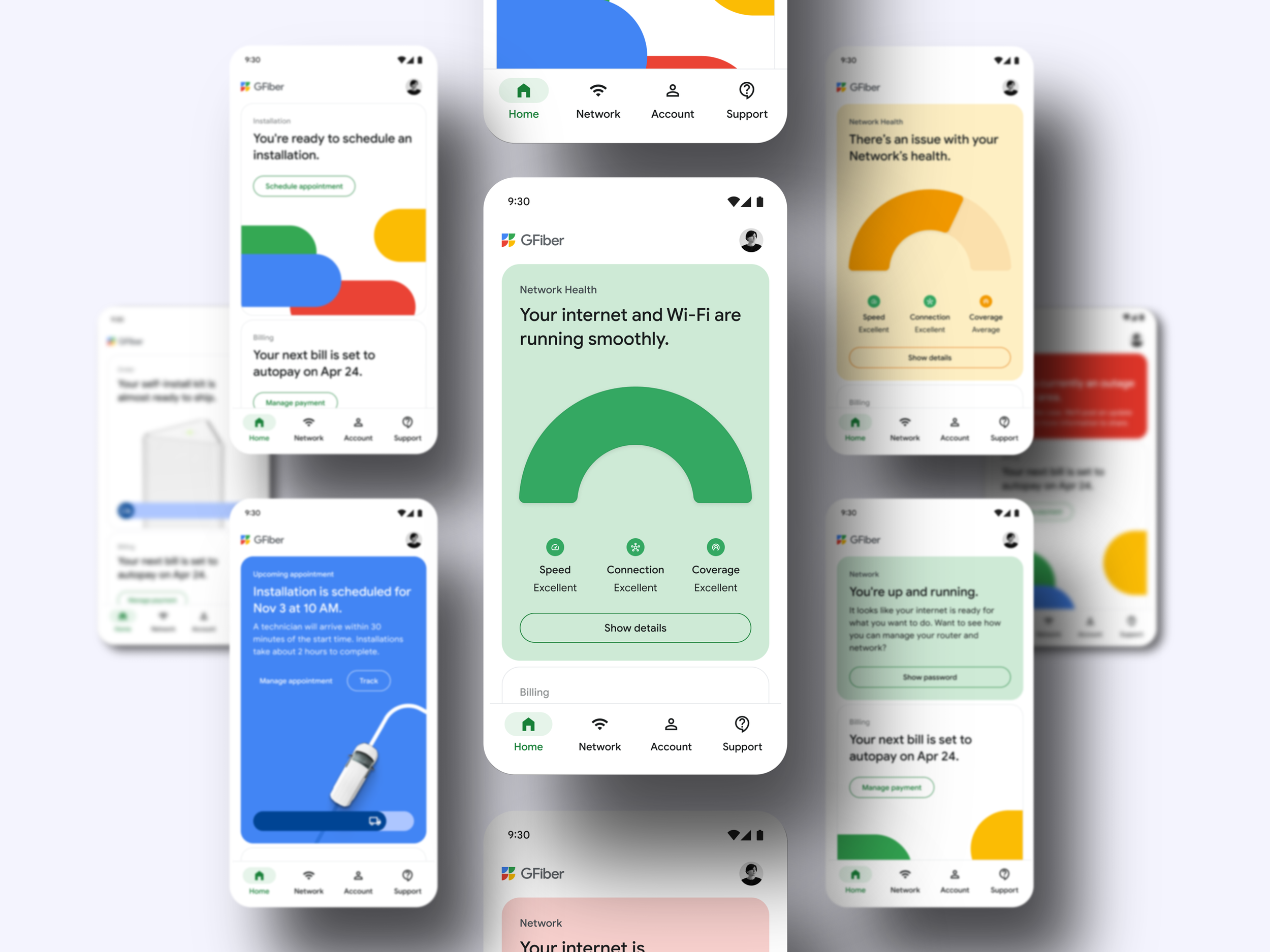
Its impact has extended beyond speed, significantly shaping the industry by prioritizing the entire customer experience. GFiber's success is attributed to its holistic approach, combining exceptional internet with top-notch Wi-Fi, customer service, and a seamless digital experience.
Crafting a Unique Brand Stance
As a smaller ISP competing against industry giants, GFiber faced the challenge of balancing its unique identity with its affiliation to Google.
As Lead UX Designer, my goal was to establish a distinct, trustworthy brand that resonated throughout the entire customer journey—from initial ad interaction to ongoing app management.
Details
Joining GFiber during a period of brand evolution, I led a team of 3 to address a fragmented customer journey and inconsistent brand identity.
Through collaborative efforts with cross-functional teams, we successfully established a unified brand experience across digital touchpoints, resulting in notable brand growth. This remains an ongoing effort, as is typical with branding and design initiatives.
Uncovering GFiber's Unique Brand Story and Visual Language
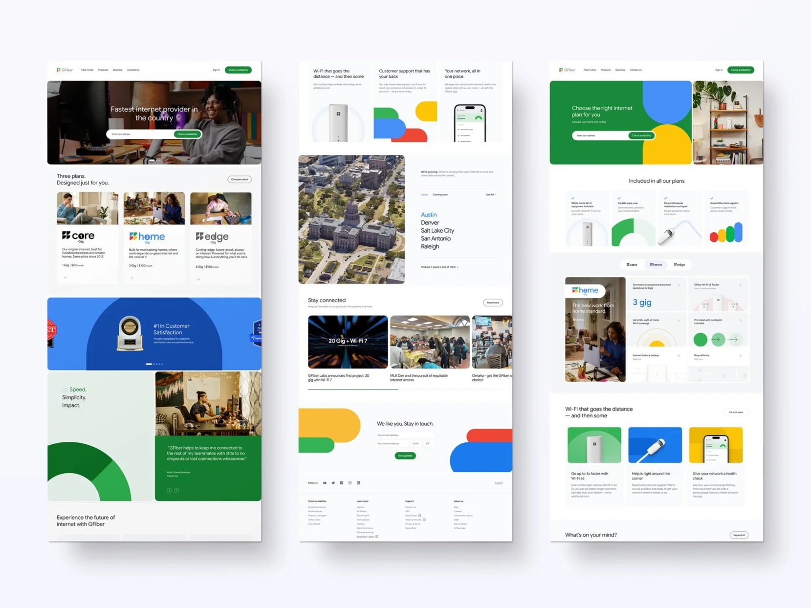
The project's core objective was to build a strong brand for GFiber, recognizing that a brand's strength lies in its core tenets. GFiber aimed to communicate three key messages: exceptional service differentiating it from other ISPs, a brand identity that's both national and local (expanding strategically yet enthusiastic about growth), and a proud affiliation with Google.
Before fully adopting Google's design system, we conducted a comprehensive audit to deeply understand these tenets, the brand's history, and its existing visual language. This process revealed both strong brand elements that could be leveraged, as well as areas requiring refinement or further development.
The Audit: Mapping the Customer Journey
As a smaller ISP, GFiber aimed to stand out in a competitive market. Our audit revealed that building brand awareness and creating a strong first impression required elevating the entire customer journey.
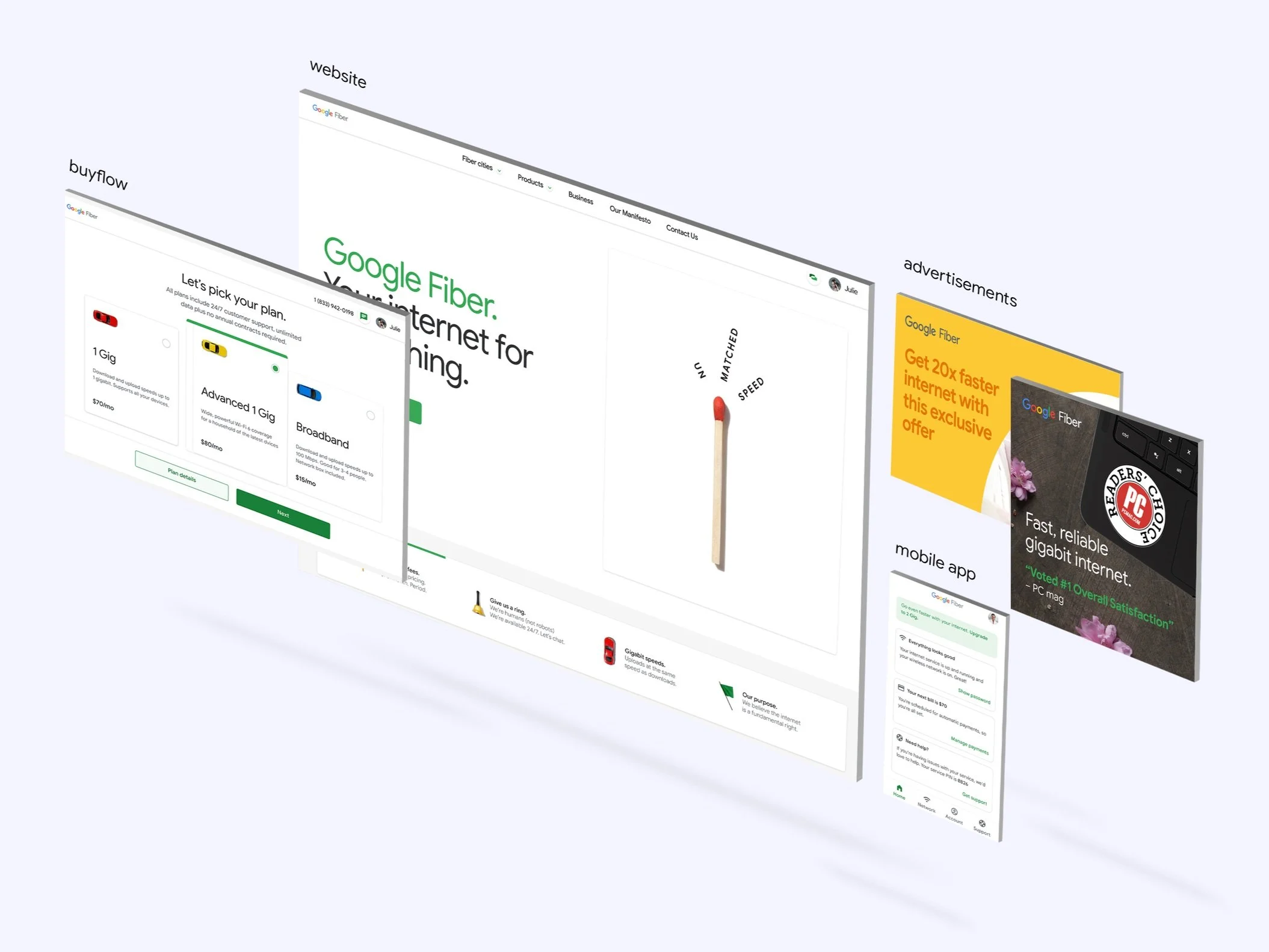
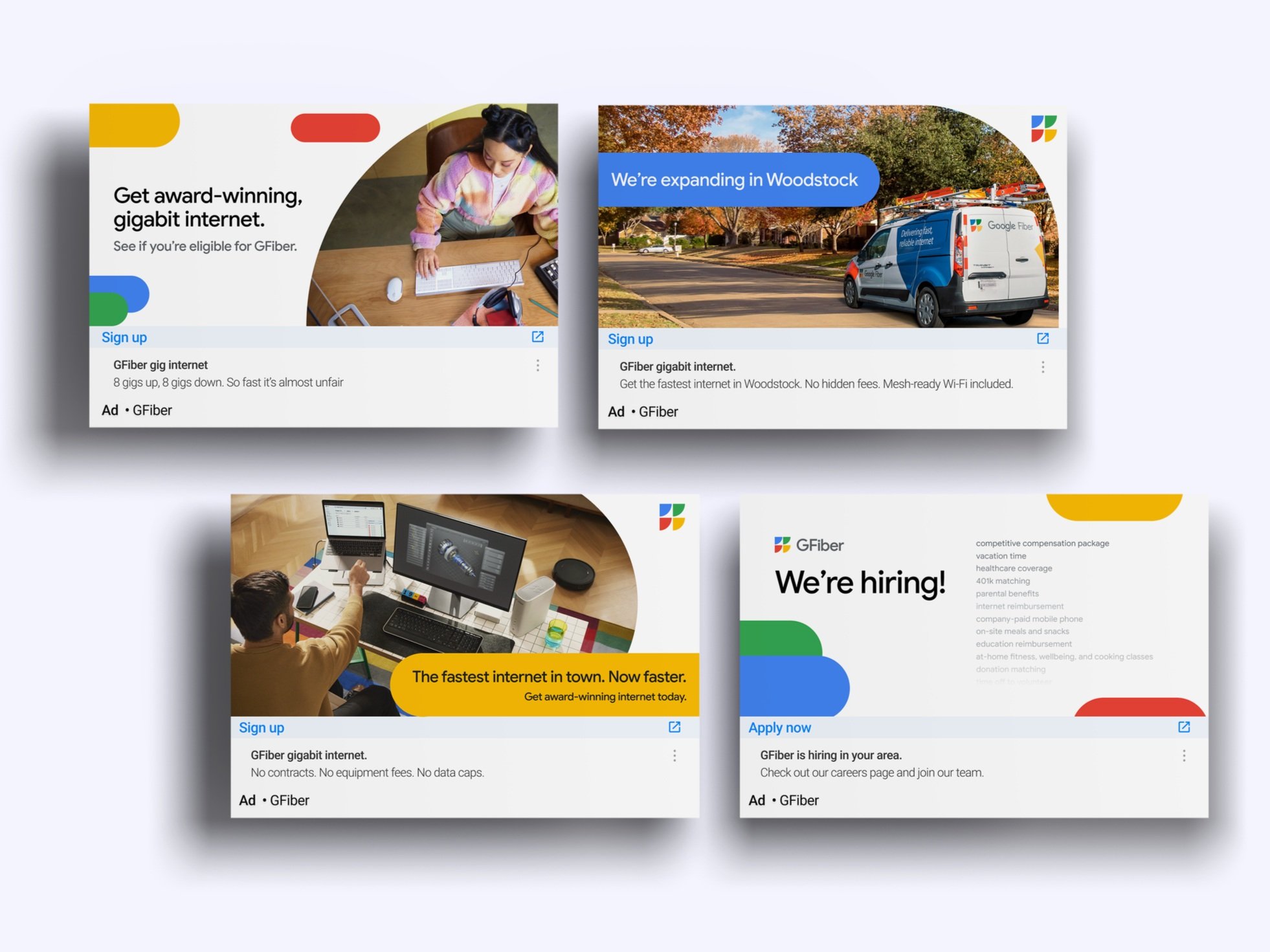
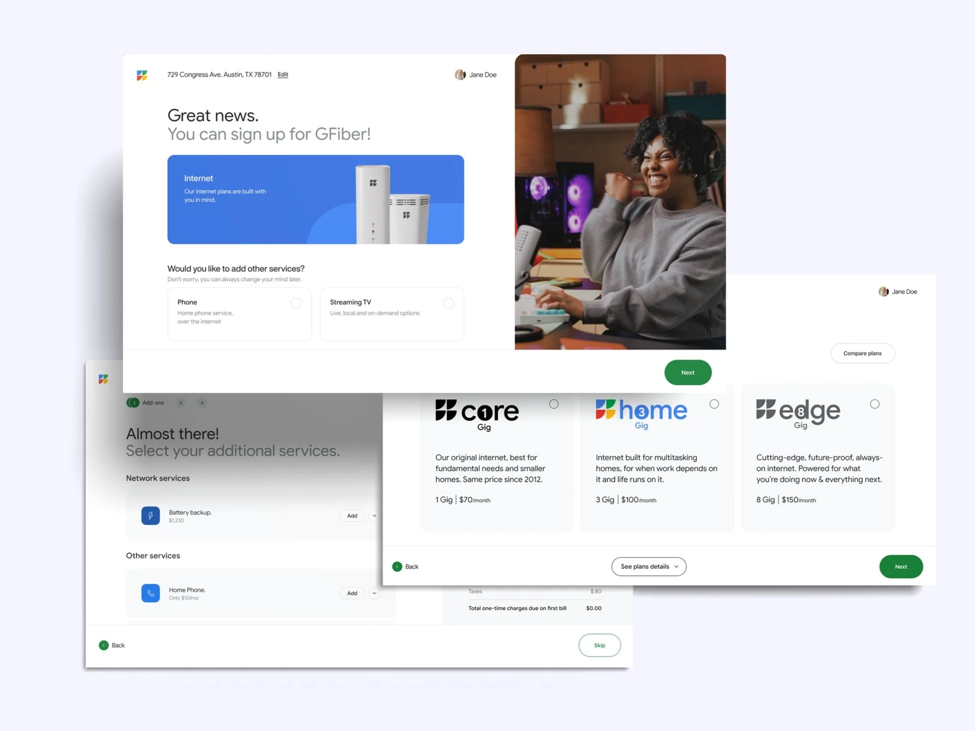
By dissecting each touchpoint—from ads to app usage—we identified inconsistencies in messaging and visual identity, revealing opportunities to align imagery, copy, and brand style for a cohesive experience. Benchmarking against industry leaders and Google's practices raised key questions that guided our strategic approach: How could we learn from others, leverage Google's expertise, and segment the customer journey to implement a refreshed and compelling brand identity?
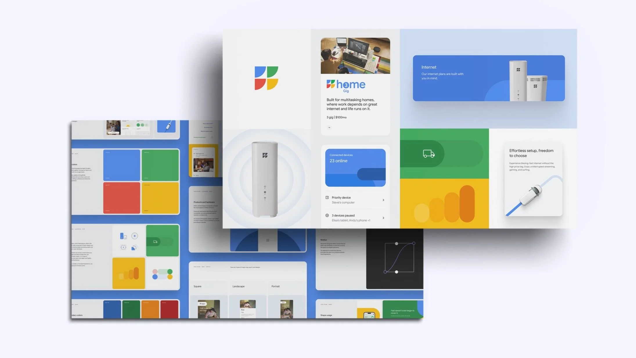
Shaping a Cohesive Visual Language
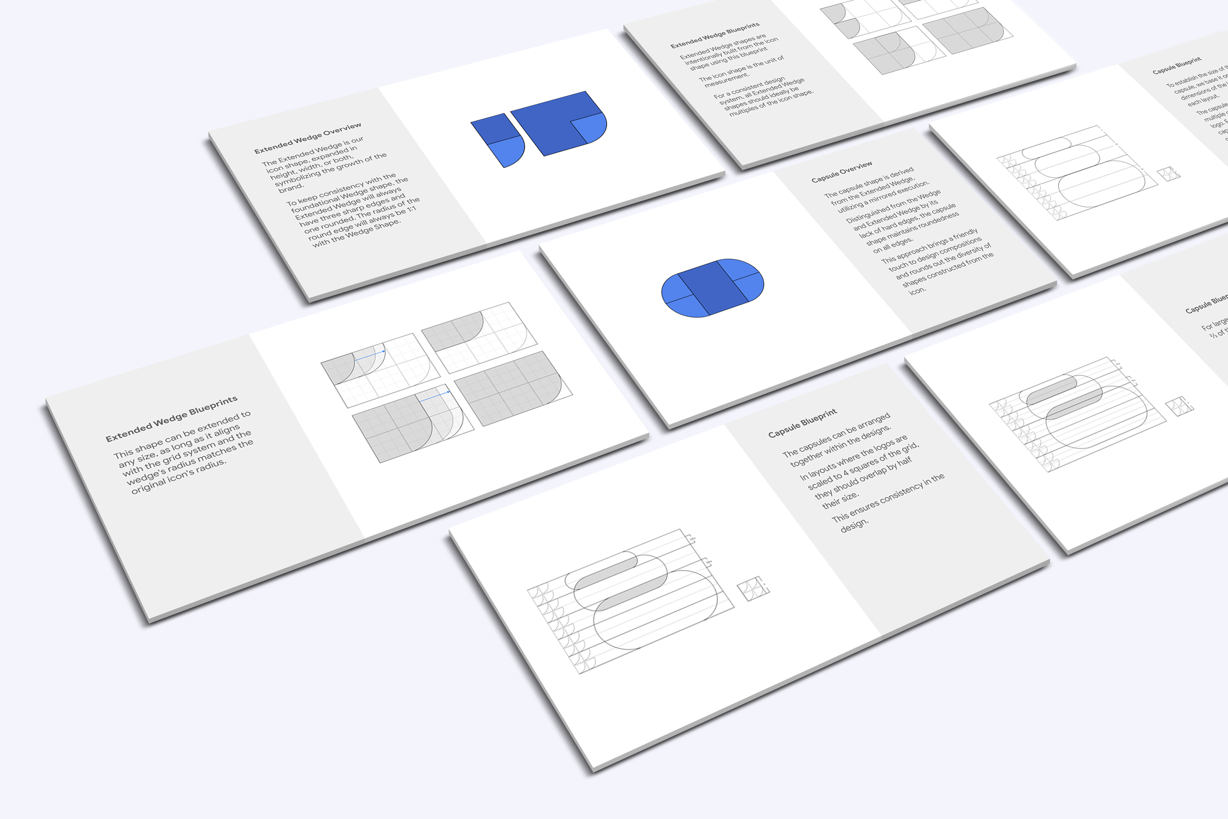
GFiber's brand evolution centered on a strategic use of shapes. The wedge, extracted from the icon, served as the foundational element, representing the brand's core values and providing stability across all touch points.
Three primary shapes were intentionally employed, not simultaneously, allowing for flexibility while maintaining a strong connection to the brand's essence.
This shape-driven approach resulted in a stronger, more cohesive visual language that provided room for creative innovation while remaining true to GFiber's established identity.
Evolution Through Refinement
Our comprehensive brand audit revealed significant opportunities to enhance the customer experience, particularly in the areas of imagery, messaging, and overall brand style.
The transition from Google Fiber to GFiber was a deliberate and phased process. As the design team, we recognized that each touchpoint held the potential to influence our customers' perceptions. Our challenge was to redefine our visual language – moving beyond a monochromatic palette while preserving a clear link to the Google brand family.
Through meticulous iteration and testing, we successfully crafted a vibrant visual identity that harmonizes with a distinct brand voice. This unified experience extends across all customer touchpoints, from initial advertising campaigns to the final purchase decision. By the time customers reach the GFiber app, they are fully immersed in and engaged with the brand.
What I learned through this
Balancing ambition with pragmatism
The GFiber rebranding was a valuable lesson in balancing ambition with pragmatism. It quickly became clear that our vision for the brand would unfold over multiple phases, not overnight. This required a shift in mindset – away from immediate gratification and towards a more strategic approach.
Managing stakeholder expectations became paramount. Their excitement was a driving force, but it also highlighted the need for clear communication and phased rollouts. By showcasing incremental progress, we maintained their enthusiasm while building trust and ensuring we could deliver on our promises. This experience reinforced the importance of transparency, patience, and a long-term perspective in brand evolution.